How I stole a blog design
Some time ago I went looking for a new color scheme for my terminal. Because let’s be honest: you can’t really call it work if your terminal isn’t dripping with the latest style.
That search led me to Let’s Create a Terminal Color Scheme by Ham Vocke.11 Ham also built Root Loops, which generates terminal color schemes from sliders called Sugar, Sogginess and Milk. It’s amazing and funny to boot. Go play with it, I’ll wait. I was mesmerized: tasty and completely unnecessary hover animations, nice colors, and everything just works so well together. I clicked and read through blog entry after blog entry.
But I didn’t stay for the color schemes. I stayed for the design.
The crime scene
So if you clicked on the link above, you might have thought “Huh, that does not look anything like your blog, Thilo. Have you been vibe coding again?” and the answer is yes — I might have had one em-dash too many, but the reason the site looks different is because it was another time back then.
See, when I visited the page it was end of 2024, back when vibe coding consisted of copy & pasting code blocks from ChatGPT.
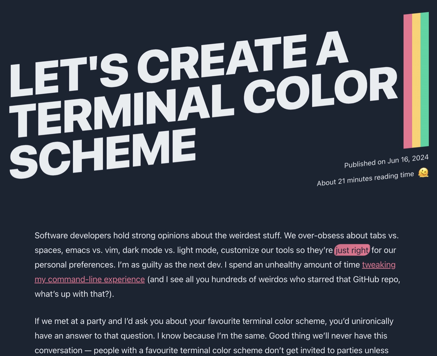
So forward to now, 2026, where I wanted to refresh my blog for the umpteenth time and my brain just somehow activated the almost two year old memory again: “Hey, remember that blog that you liked? Maybe now with the help of Claude Code you can steal it”. Because yes, without the help of AI I’m even incapable of stealing another person’s design.
And that’s what I did.
How the headline works
So now let me try to explain something that I’m not even capable of stealing myself: the cool tilted headline, with a smooth animation on hover!
Stealing a design
Hover over or tap the headline.
<h1>Stealing a design</h1>h1 {
font-family: "Archivo Variable";
font-weight: 850;
font-stretch: 115%;
text-transform: uppercase;
line-height: 0.92;
}.headline {
transform: rotate(-3deg);
transform-origin: 0 100%;
}.box {
position: relative;
padding-right: 0.9em;
}
.band {
position: absolute;
inset-block: 0;
right: 0;
width: 0.6em;
background: linear-gradient(90deg,
var(--c1) 0 33.4%, var(--c2) 0 66.7%, var(--c3) 0);
}.band {
transition: width 650ms cubic-bezier(0.65, 0, 0.25, 1);
}
.headline:hover .band {
width: calc(100% + 0.3em);
}
.headline:hover h1 {
color: white;
-webkit-text-stroke: 0.035em var(--deep);
paint-order: stroke fill;
text-shadow:
0.02em 0.02em 0 var(--deep), 0.04em 0.04em 0 var(--deep),
0.06em 0.06em 0 var(--deep), 0.08em 0.08em 0 var(--deep);
}So we start in step 1 where we basically just have a headline. Nothing special yet. We add a little spiciness in step 2 by changing the font and making the headline heavy and wiiiide. To make it more crazy, we add a -3° tilt in step 3. Then in step 4, the touch of color with the three stripes, realized as one gradient with hard stops. And finally, the animation-voodoo in step 5: popping out the text with a text-shadow and stretching out the gradient to fill the whole headline.
Et voilà: a freshly baked stolen design 👨🍳
Every post gets its own colors
But because I cannot for the life of me make any decision at all, I need five different color palettes that I can choose from:
lagoon
ember
orchid
moss
space
Credit where credit is due
Of course, “stolen” is a big word. The tilt, the stripes and the pop-out are all Ham’s ideas. The code was written from scratch (by Claude, with me pointing at things and saying “more wiiiide”). That’s why every page on this blog now says Design inspired by hamvocke.com in the footer.
So Ham, if you ever read this: thank you for the inspiration, and sorry. Also thank you for redesigning your blog since then, so nobody will notice.
And my terminal? Still running the default color scheme. Maybe I’ll finally go and have some Root Loops.